Jake Cox is an illustrator who is studying in Manchester. I approached Jake to collaborate with as I had admired his work for a while and thought we could make a really nice publication that is more playful.
Q&A
In order to better understand Jakes work, I asked him a few questions. This helped gain an understanding of the way he works and
When do you feel you found your style of drawing?
"I don't think I've really got a style pinned down. I just get obsessed with a character or one way of doing things and go off on one with that until I'm fed up with it."
"I think my work has taken a bit of an ugly turn recently and away from funny littles characters, I want to get back to that though."
Do you have any big inspirations?
"Jakub Julian Ziolkowski, Butzer (German abstract expressionists in general), Erlend Peder Kvam.


Do you set your drawings in a world with characters of your creation?
"Yes, I've been building it for years"


Research into illustrative publications:
Ode, Somnath Bhatt
Ode is a publication encapsulating the work of Somnath Bhatt. The book is Risograph printed with scarlet, cornflower and metallic gold inks to reflect his multi-media approach as an artist. In contrast, the drawings themselves are digitally created, however they appear as if stitched into the book through the way he has manipulated them.
The colour palette choice was to represent a mound of earth, a clot of blood and a heap of gold. He said that he "consciously chose to print the whole book in gold because when the light shines on it, it activates the forms that are drawn.” The book is saddle stitched using one paper stock that is sand coloured, linking to his and causing the reader to focus on the print itself rather than the books form.


Outdoors, Jean-Philippe Bretin
Jean-Philippe Bretin was to re-design a graphic novel by Yuichi, who is an avant-garde manga artist who illustrates futuristic narratives with a punchy aesthetic to match. His work is full of bold vivacity, and so Bretin chooses to utilises the “raw content” of the comic artist’s powerful visuals to inform his cover design. He intentionally keeps the title out of centre on the spine and partly covers it on the cover. He explains, "the drawings overflow and all the other visual elements require action by the reader to reveal themselves completely.” The inside is much more sober, keeping the design contemporary like the work.


Jake's work:
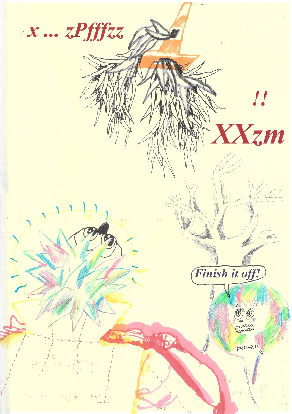
I had a few ideas on how the book could be put together, however it was mostly up to the content. I explained these options to Jake and he decided he would like to create a narrative story that is more of a proper book rather than something like a zine or poster book.


When he sent the work I was worried as he had already added type, made a cover, and the drawings he did were on yellow paper. This meant I needed to remove these bits of text best I could and keep the yellow background as pat of the design.
However the drawings are very colourful markings that have a child like charm.


No comments:
Post a Comment