This brief asks to choose a secret that we want to communicate as a group.
Initial ideas for the secret and what could come of it:The chosen idea is laughing stock as this has the most potential for outcomes and the most clever idea.
The plan for the brief is to have projections of stock images pointing and laughing in a busy space. From this we would like to take images of peoples reactions to the projections to be collated into a book. An animation of the stock images and the branding for this will also be made in order to advertise this or have on the projections. This branding will be similar to how the stock images look with the title 'Laughing Stock' written diagonally across the page. Between the words will be lines, similar to how they do it. The chosen typeface is Gill Sans as this is a typeface that they use on the stock images.
We thought it would be effective to emboss the front cover with this design, so that it looks like the watermark on the stock image; visible but not at the same time. However this wasn't effective from the laser cut due to its limited depth. Instead we had the idea to spray paint chrome paint, which is visible in the light. This gives the effect of opacity that the watermarks give over stock images.
 |
| Design laser cut into card. |
Images of emboss:
 |
| Laser cut card used as stencil. |
 |
| Spray pained onto different paper stocks using the stencil. |
Unfortunately we found getting permission for a public place is too difficult, so a plan B idea for the book was thought up in that the book just has images of the stock images with type that questions who they are laughing at. The last page will have a stock image of someone holding up a mirror to represent that they were laughing at the reader. This was printed out and perfect bound as a prototype, however due to the bind, the content disappeared in the middle of each page. To improve this, a bleed will be added so that there is space for the bind. The paper stock is also ineffective as it is so thin and boring. We decided the front cover could be spray painted onto a variety of different stocks, and the content could be printed onto photo paper, linking to the image aspect of the content.
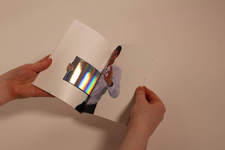
The last page of this idea uses a stock image of someone hold a mirror/frame, in order to communicate that it is the reader they are laughing at. To test this, reflective card was tried stuck into that area, and reflective vinyl. The vinyl was most effective as it was less thick, sticking to the page well.
Another idea was thought up of using the size of the image to zoom in so that the reader cannot tell the image is of a person pointing at them. This was effective as it made people curious, wanting to them to read more, eventually realising the concept of the book.
We decided to merge the two ideas together using the zoomed in images and the plain stock images with text to tell more of the story in the book.
As well as the book, posters were made in order to advertise the book. These used the same stock images as in the book but instead of the bottom part of the poster that states the copyright, it has words to make the sentence 'You are a laughing stock'. This is effective as it represents the book well and catches people's attention. However it doesn't work well in advertising the book as there is no reference to it. This could, however, work well to produce reactions to the posters.
The final outcome uses the stencils made in order to spray paint the cover chrome as this colour is most visible when in the light.
Overall this brief was a success in that the idea was solid and the outcome worked well. Although the initial idea could not be carried out due to time and accessibility issues, the outcome was still successful in producing the same effect.


No comments:
Post a Comment