The initial ideas I had for the publication were based around the colours he uses and the shapes.
I picked out an area of one of the drawings and blurred that area of colour creating a gradient that could be used throughout the publication as part of the layout.
I picked out a typeface for the title 'S.E.' that is bold but serif to communicate a similar visual that Jake was trying to create with his attempt at type whilst communicating the story and 'world' he has created. The typeface was found on Typelab, called Bogoni, by Doerffler. It has sharp diagonal beaks on the characters, communicating a medieval but futuristic letterform, which seems suitable for the world that Jake created. I used this as the container for the gradient, creating a colourful title that communicates the content well.
I also tried Tschick, by Daniel Stuhlpfarrer, which due to its lack of serifs is more futuristic looking; not fitting the suiting the content as well.


As well as designing title type, I picked out a face of Jake's drawings and thresholded it so that it was just the lines of the face. This was then used to create a dust jacket, or maybe a page layouts for the first pages.

Layout sketches:
The design of the layout utilises the work he gave me, using type to communicate the story in the most effective way. When looking at the type he added and the way the story is told, there is a humour about it that brings British slang together with typical comic type. I wanted to keep this element throughout my own designs.

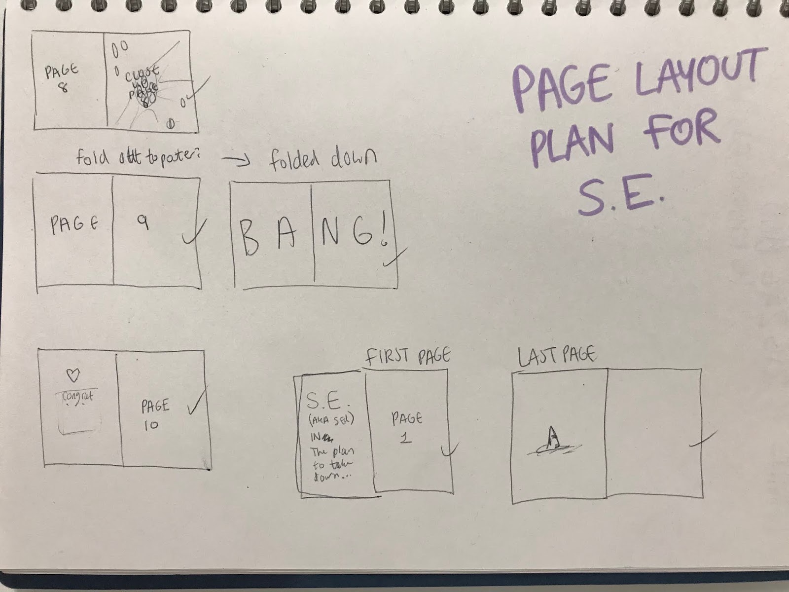
Using this plan, the layout was created using colour and image from the work by Jake. Type he added had to be removed apart from small bits that were too hard to get ride of and ruined the imagery. Some of the layout from the sketches were ineffective and so had to be rectified, however it still effectively communicates the story and Jake's style.


After creating the first layout I realised there was s spread that I accidentally put in twice. This version fixes that and also improves the layout for some of the pages.


The above layouts worked well for perfect binding, however the number of pages didn't work for saddle stitch. This version rectifies that by removing two pages. As this took away a bit of the content, one of the pages was cropped and added to the spread before, which works better than the layout I had before as it makes more sense and is more visually cohesive.


This layout experiments with placing a block of colour from the page it is on in the centre of the spread. This meant the content of that page had to be moved outwards from the colour so that it would all be on display. This changed the dimensions for the book into a size just larger than the ration of paper, which is something to be considered when printing and binding. This would be effective with a stab stitch as the colour wouldn't be part of the layout of the page but in the bind. This way none of the content gets lost in the bind but there that visible yet unimportant area is still considered.


No comments:
Post a Comment