Joe Gillmore is a graphic designer who specialises in designing art books for artists and galleries. He has worked in a studio for a couple of years before becoming a teacher. He is also an artist, causing his work to be more experimental. He also designs record covers (Come Play With Me) and exhibitions.
He now aims to create books that are art itself, with more of a conceptual design.
WORKS:
Void ( )
From a blog of found images of art and design, which acts as visual research for him, he made a book that defies the general structure of reading a book. He created a reading system that is not linear, where the images are chopped in half, each half on different pages.
sevenpointfourfivebooks.eu
A challenge which you are to make 7.45 books in a year, which are then shared on the website.
Void ( ) 2
Chopped each image in half, printing them in different colours (pink & red) on top of other half of images. The outcome of this is reminiscent to the way that a deck of cards is shuffled, creating a random outcome on each page.
The Zero Point of Structure
Realised sugar paper bleaches easily if left in the sun. Used this to create an impression of a book by leaving a book on each sheet of paper. The title suggests a missing sculpture, which is the book that has been recorded on the paper.
B.
Used censorship to cover up .45 of images within the book. Printed the content then printed the black censor box over top so that the images could still be faintly seen underneath.
POP
Found a magazine in the classroom that had been cut up by students. Scanned in pages where different images come through, acting like a collage on each page.
Humpty Dumpty in Finnegans Wake
Inspired by Ulises Carrion who created poetry based on rhythms. Released a vinyl LP with his poetry being read. One of his works inspired Joe to create a book on Finnegans Wake of scans of each page that mentions Humpty Dumpty.
ALPHA
Photocopies of pages of books, enlarging them, overlaying, more photocopies, etc. to create mad visual textures. Bound randomly so that there is a disjointed structure of random half of pages throughout.
BRIEF:
Make a zine of at least 12 pages, any size on the subject of 'the book'. Your book should reveal something about books: the way they are read; designed; stored; archived; found; used; written; destroyed etc.
You may use any medium or process. for example photocopying; InDesign; a book sculpture; photographic.
What is the function of books? Form? Structure?
What types of book are there? Dictionary, photo book, artists book, books about books.
Think about printing, binding, paper, format.
THE ZINE:
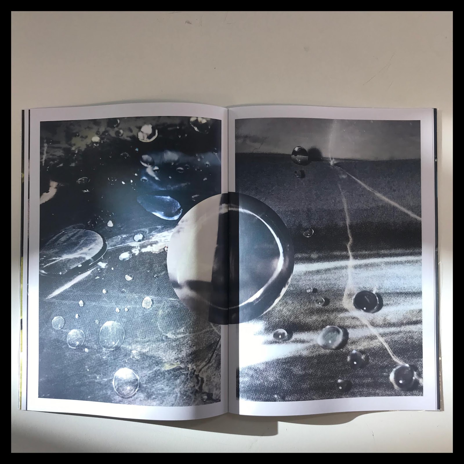
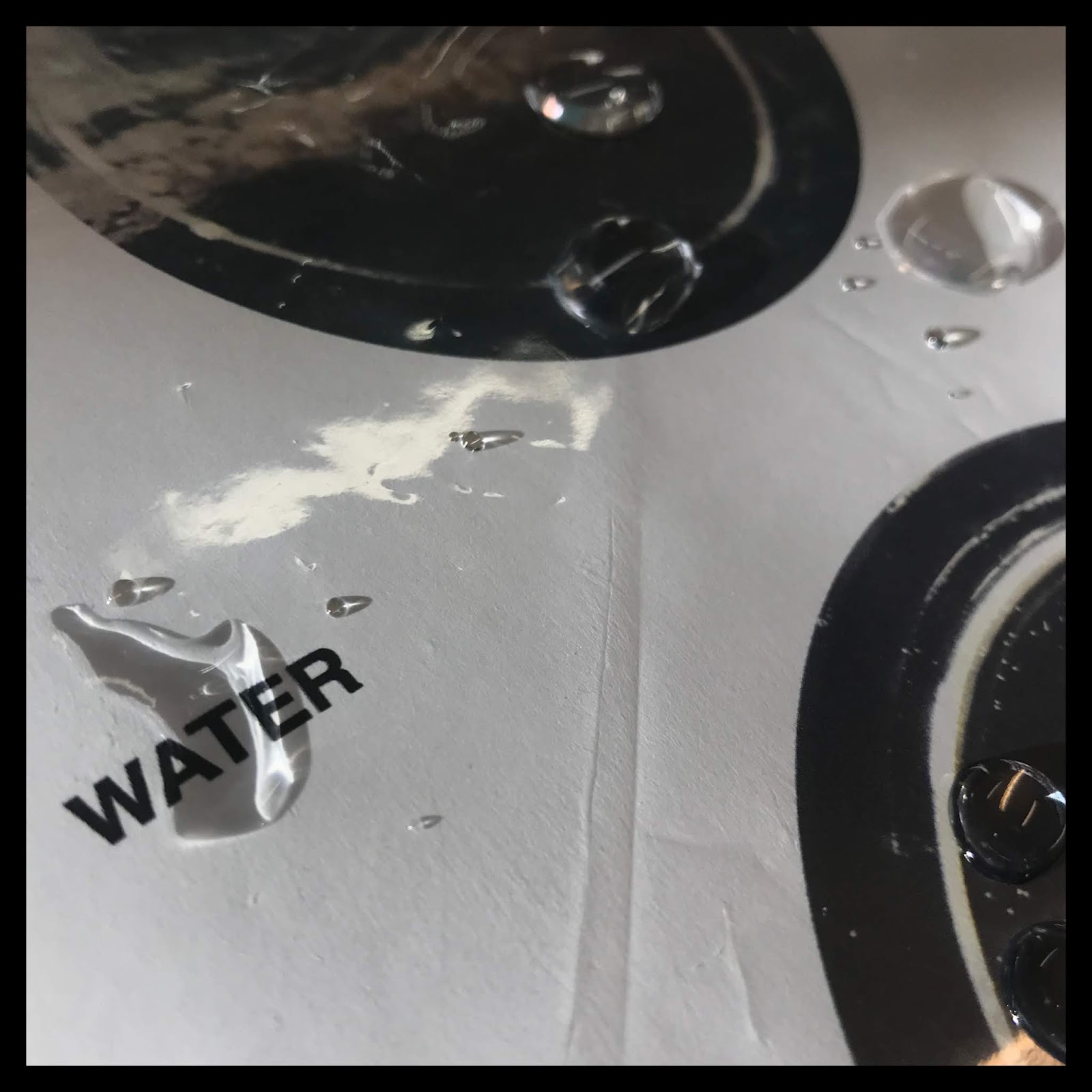
My idea for this brief was to look at a book on water and create a reaction between the book and water itself. This would be done by dipping the book into water then scanning pages, dripping water all over the page and capturing that, or looking through a cup of water and capturing images of the book that way. This reveals the relationship between the book and its content, and how it is often so different in its form, especially this one.
As the book wasn't to be damaged due to it being a library book, I took a sheet of cellophane, which was placed over the area to be captured. I then dripped water onto the cellophane, creating lots of water droplets on the surface. I found using the flash for this useful, bring out texture and detail.
The book talks about lots of different aspects of water, including water-pollution. This inspired an idea of using a plastic cup filled with water to capture images of the book, revealing an interesting contrast of viewing through plastic and through water.


The images taken where cropped to get rid of the super light areas in the photo as well as focus on the most interesting areas. Contrast was increased to improve the detail and quality of the image, and the dpi was increased to 300, ready to be put in the book format to ensure quality.


The layout for the content was purely to show off the images and the contrast between the plastic and the water.


The final book is printed A4 onto printer paper stock. This was simply done due to lack of time. If I could I would have printed onto photo paper in order to improve the print of the images.
I then perfect bound the book with a cellophane cover to represent water through its transparency, and to provide a surface on which the reader can also play with looking through water without damaging the book, the same way I did. This allows the reader to almost copy the process the I went through and see the book react to contact with and viewed through water.
I think the book is successful in creating a connection between the content in physical form and in book form, questioning how the book strips any representation of the content other than use of imagery.
I wold like to have added type to some pages and considered the layout more, as well ass the front and back cover. However it looks professional and presents the imagery successfully.


No comments:
Post a Comment