E-publications
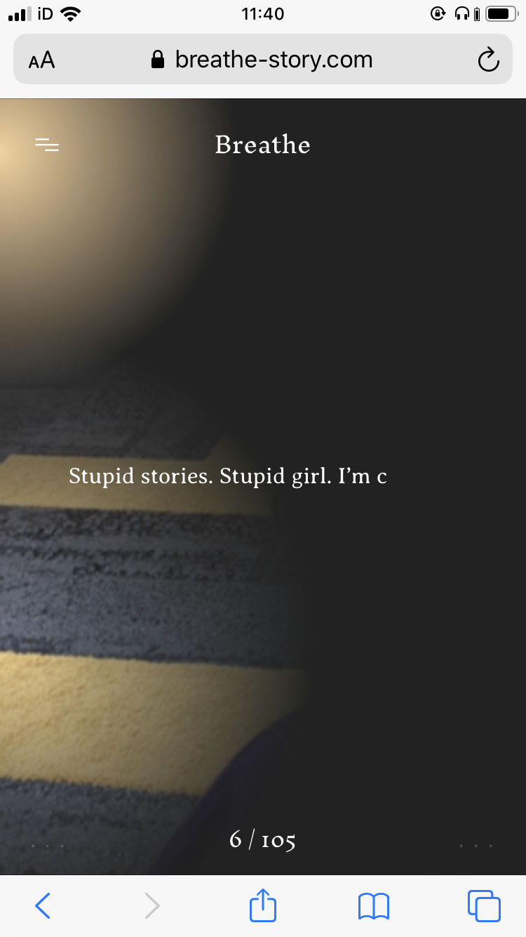
http://www.katepullinger.com/breathe/ Breathe by Kate Pullinger is a ghost story to be read on your phone, created by the experimental publishing house Visual Editions and Google Creative Lab who aim to explore how technology can reshape our expectations of what a book should look like. This book uses your phone data to personalise the narrative for each read. It takes the data of your location, the time, weather, etc. to edit the story and feel as though a ghost is following you. In a way it's an infinite story. https://vimeo.com/266299944 


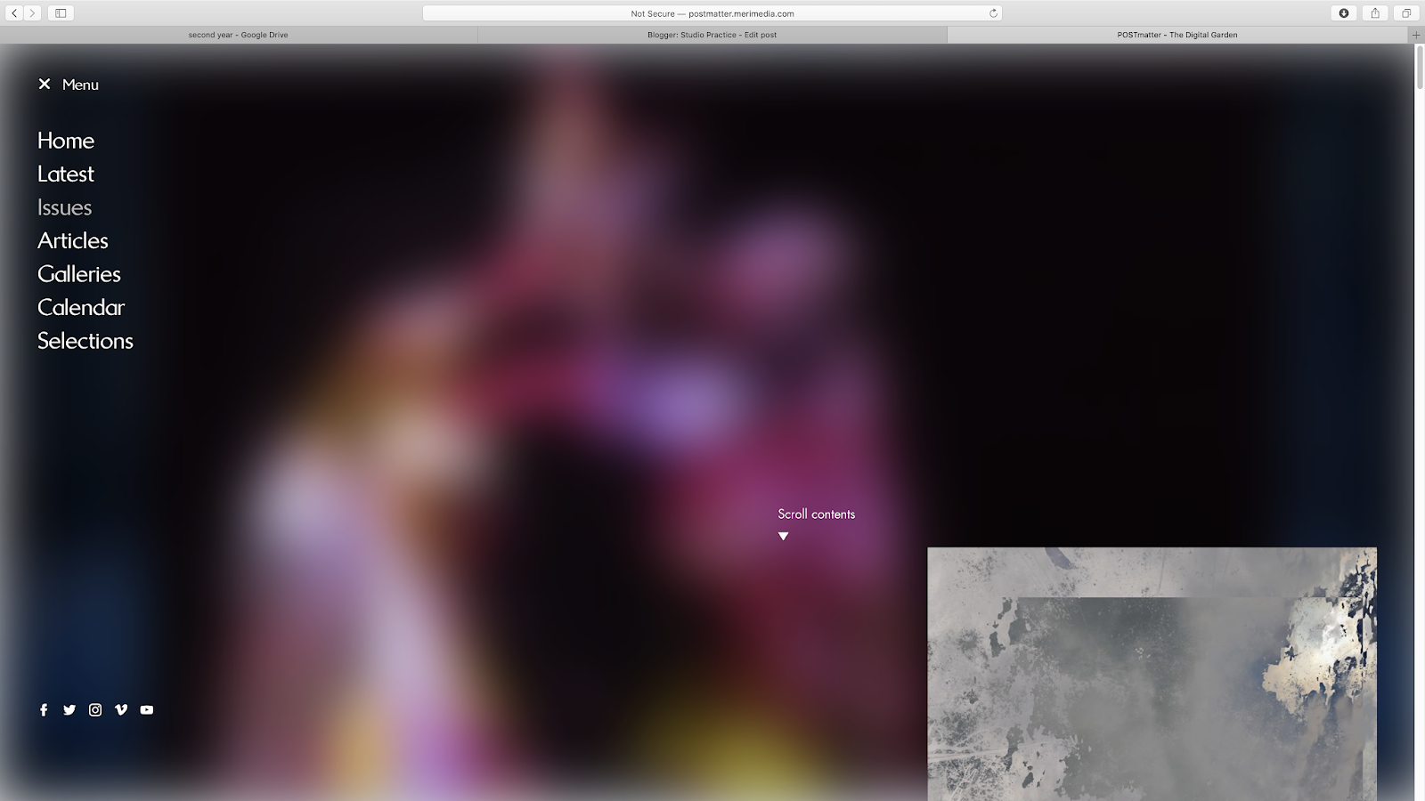
http://postmatter.merimedia.com/ POSTmatter is a digital art magazine, designed with a print-informed, yet expansive and experimental approach. This brings the magazine more design potential, however tests the limits of the point in which the magazine becomes a blog. Initially, the layout of this magazine has a blog type feel, scrolling through images that provide info when hovering over it with the mouse. This gives the magazine a very image reliant process in which the reader is to choose which image draws them in to find out more. Once an article is selected, there is more of a physical magazine feel to it in which you click through each slide as if pages or columns in the magazine. I don't think this enhances the content in anyway apart from giving the reader less to read. However this gives the short text approach that digital media gives, creating more of a digital feeling again. One enhancement this way of reading provides is the access to videos and large scale high definition imagery that is places through the slides separate to the text allowing the images and videos to spread entirely across the screen.


https://thedisconnect.co/one/ The Disconnect is a literary web magazine that can only be read with the wifi turned off. This enhances the expereince of reading on a digital platforms as you have less distractions of notifications, etc. However the design of the magazine and contents itself lack any enhancements, simply being a vast endless scroll of text. The initial idea of this magazine is promising, yet isn't carried through.


https://toggl.com/timesheets-magazine-berlin/index/ T:imesheets Magaz:ne is a digital magazine that takes the best of both digital and print. Aspects of print are obvious, such as the two page spread and sliding pages. However the use of its digital form brings a more playful interactive element. It allows more rule breaking design to be incorporated without breaking design rules. For example the large title with a playful typeface, which is adding a personal element to the article, is spread across both pages, disrupting the reader to read anything behind it, however as this title only appears when hovering over one of the names, this disruptive design can easily be taken away, allowing the reader to have more control over what they would like to view. This can give more design potential to the magazine that print may not be able to do, however, does this give the reader too much control?
“It’s really just a magazine in the sense that there is no CMS or backend behind it,” says Kelemen. “We intended to keep it that way so that we may have the freedom to play around with the design with each issue. We also wanted to avoid creating a new blog.”
'The way such elements vary and transform is reminiscent of the fluid, energetic, pop-up-loaded nature of online media. Yet the visually arresting design still engages readers in a simple, compelling long-form reading experience.' - EOD


Indirect Flights is an online work that creates a layered landscape for the user to explore in an endless panorama that extends to all directions. Each layer moves at different speeds giving the illusion of depth and revealing and hiding parts of the landscape as it moves. This is a very unique way of using the digital platform to create a piece of work that experiments with how the landscape is seen in the digital age. This has lead me to question if having pages is necessary with an e-publication.


Indirect Flights is an online work that creates a layered landscape for the user to explore in an endless panorama that extends to all directions. Each layer moves at different speeds giving the illusion of depth and revealing and hiding parts of the landscape as it moves. This is a very unique way of using the digital platform to create a piece of work that experiments with how the landscape is seen in the digital age. This has lead me to question if having pages is necessary with an e-publication.


Rules I want to avoid in my e-publication:
1. No Scrolling.
2. No visual indications of the story, unless creating a vibe or using the illustrations provided.
3. Each page kept separate, but with a transition that doesn't disrupt the reader.
4. Create a more enhanced story is small simple ways which keeps the reader engaged.
The outcome could be in VR form, a website or an e-book (pdf).
Crit with Helena:
Helena suggested to use a Franz Kafka short story for this project as some of them are very short, only a page long, meaning I can try out a few ideas in the time frame we have.
She also suggested that the website could be an endless scroll in all directions where you can scroll to any point of the website as the story still make sense. This could be translated into VR form as well where anywhere you look has a part of the story. This would mean adapting the Authors writing, exploring themes in the essay related to The Death of the Author.
No comments:
Post a Comment