COP
Written outcome - 2500 written word piece, harvard referencing, bibliography.
Practical outcome - 6 design boards.
Blog - blog project developments.
Structure for essay:
Introduction - what you are investigating.
Critical argument - discussion and analysis of trangulated academic sources.
Analysis - using case studies that relate to theme.
Conclusion - discussing evidence raised.
Harvard Bibliography
Submission 23/04/20
For the essay:
- What is interesting and why?
- What is there to find out?
- How could you investigate this?
Choose an area of practise;
Typography
Advertising
Branding
Publishing / Editorial
Design for Screen
Think about themes/issues within this area of practise.
Think about…
What you know
What friends and family know
What researchers, theorists, experts and other people know


- what is interesting?
- What is there to find out?
- How could you investigate this?
Many online “versions” of print resort to flickable pages and paper-turning sound effects, however is there a way to create an online publication that is better than a printed publication?
'Mobile books are designed with some inherent tradeoffs—in the place of paper, there’s glass; instead of ink, there are pixels. But these tradeoffs aren’t necessarily a bad thing. Books on screen might lack the tactile magic of print, but they also open a world of new possibilities enabled by technology.' - Liz Stinson the managing editor of Eye On Design.
Examples of design/images that fit in with this theme:
BOOKS
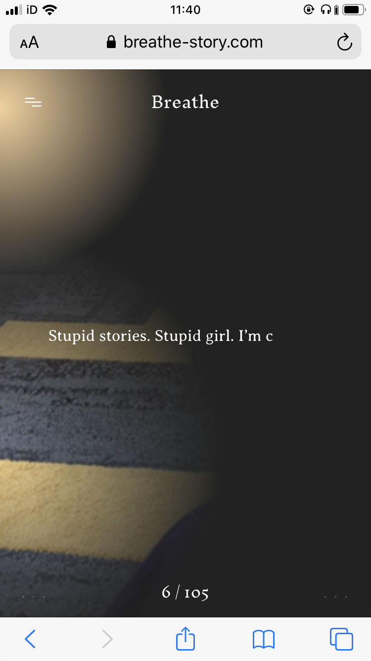
- http://www.katepullinger.com/breathe/ Breathe by Kate Pullinger is a ghost story to be read on your phone, created by the experimental publishing house Visual Editions and Google Creative Lab who aim to explore how technology can reshape our expectations of what a book should look like. This book uses your phone data to personalise the narrative for each read. It takes the data of your location, the time, weather, etc. to edit the story and feel as though a ghost is following you. In a way it's an infinite story. https://vimeo.com/266299944


MAGAZINES
https://eyeondesign.aiga.org/the-digital-mags-challenging-outdated-reading-content-rules/
- http://postmatter.merimedia.com/ POSTmatter is a digital art magazine, designed with a print-informed, yet expansive and experimental approach. This brings the magazine more design potential, however tests the limits of the point in which the magazine becomes a blog.


- https://thedisconnect.co/one/ The Disconnect is a literary web magazine that can only be read with the wifi turned off.

- https://toggl.com/timesheets-magazine-berlin/index/ T:imesheets Magaz:ne is a digital magazine that takes the best of both digital and print. Aspects of print are obvious, such as the two page spread and sliding pages. However the use of its digital form brings a more playful interactive element. It allows more rule breaking design to be incorporated without breaking design rules. For example the large title with a playful typeface, which is adding a personal element to the article, is spread across both pages, disrupting the reader to read anything behind it, however as this title only appears when hovering over one of the names, this disruptive design can easily be taken away, allowing the reader to have more control over what they would like to view. This can give more design potential to the magazine that print may not be able to do, however, does this give the reader too much control?
“It’s really just a magazine in the sense that there is no CMS or backend behind it,” says Kelemen. “We intended to keep it that way so that we may have the freedom to play around with the design with each issue. We also wanted to avoid creating a new blog.”
'The way such elements vary and transform is reminiscent of the fluid, energetic, pop-up-loaded nature of online media. Yet the visually arresting design still engages readers in a simple, compelling long-form reading experience.' - EOD


No comments:
Post a Comment