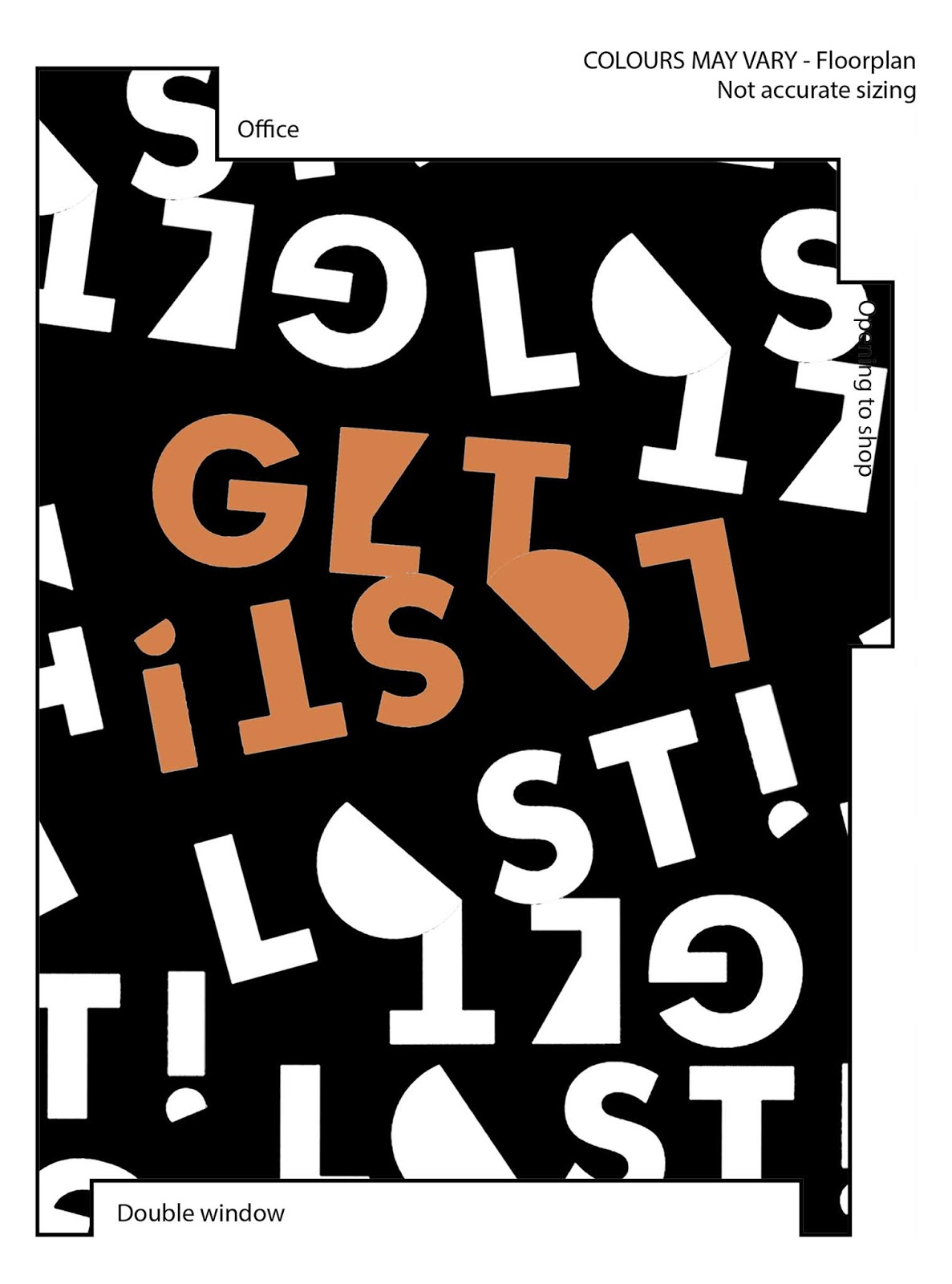
Floorplans:
The designs of the floor use vinyl in the shapes of the symbols used throughout the branding. The group concluded that the most successful one is the blue arrows as lacks clarity in which direction it actually wants you to go, therefore guiding the audience to any direction they wish to go. It references the lost aspect as they could find themselves lost when following the arrows.


No comments:
Post a Comment