Notes on briefing
PDF max 5mb
Front cover only & full cover spread
Template given by penguin
Visually explore narratives and ideas
What are obvious responses, how can you avoid them?
Imaginative, original, strong use of typography, trendy, different
Keep in mind design principles
Research trends in book design & marketplace
Research marber grid
Across the cover, spine and back of physical book
What does the viewer already know?
‘A smile in the mind’
Reference content
Digital formats? eg texting, social media
Research into author
Textures
Less is more
Photography?
Starting points:
Modify an object
Type only (erik carter)
Simple diagram
3D (by hand e.g. photo of standing paper, shadows)
Collage
Penguin books
Marber grid
The Marber grid was created for the Penguins series of Crime fiction novels. The grid entails the type in the top third of the page, allowing illustration to cover over two thirds of the page to allow the imagery enough space to grab the attention of the browser.

I found penguin books that showed themes linking to The Establishment.
These covers are all very minimal with their use of colour, making them appear strong and direct. The first uses imagery of a wealthy looking man, showing only detail and bringing the focus of the figure on the eyes, bringing a sense of mystery. The text is bold, creating an eye catching cover. The second is of a newspaper, which has given me an idea of using a newspaper for the cover for The Establishment as the book has a lot on media. However, as Penguin has already used newspaper for the cover of the book it could be considered an unoriginal idea and not very contemporary. The third is a comedic collage that appears to be rebelling against the queen. The imagery of the queen is taken from a British note, with the Union Jack flag surrounding. Over this is a drawing of rude and comical features. The text is in fancy, over the top writing, embellishing the cover to exaggerate the culture around Royals and those in power. This could be an idea of which to base my cover for The Establishment as it deals with power and hierarchy, and how the system is so corrupt. The final cover I looked at is based on patterns. The simplistic design uses cut out paper to repeat the illustrated pattern above the text. This brings a 3D element and could suggest a theme repeating events and secrecy.


The establishment covers
The already existing cover for The Establishment are very simplistic and rely of illustrative elements. The first is focused on the idea of money and the idea of getting away with taking it. The cover is black and white with yellow used for the areas in focus. The second design is the most common and known for this book. It is very minimal, with no se of colour. A simple illustration is the focus point of the cover , however in my opinion this illustration appear as a murder mystery book and is very dated. The type is in a serif font, which is appropriate to convey the hierarchal theme of the book. The spine is the same design as the front, being repetitive and boring. The blurb doesn't help this, simply displaying the required text in the serif font aligned in the middle of the page. Although the simplicity is effective, the elements of the design are very simplistic and uninteresting. There is clear evidence of the Marber grid in use in the third cover. A comedic illustration takes up two thirds of the cover, with very simple type in the top third.


Other book cover research
Erwin Wurm ‘one minute sculptures’
These photographs are simple images that would be appropriate for the cover of a book to portray themes in the book in simple ways. Combining text with these images would be an interesting contemporary twist on book cover design.


These photographs are simple images that would be appropriate for the cover of a book to portray themes in the book in simple ways. Combining text with these images would be an interesting contemporary twist on book cover design.
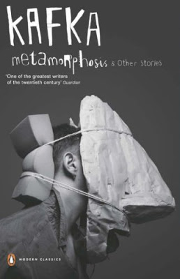
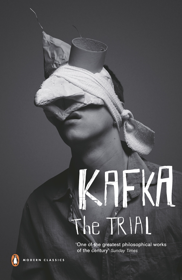
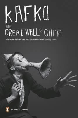
Gary Card & Jacob Sutton
These book cover designs are photogra[hs with type that has also been photographed. They appear very contemporary nd relay the themes of the book in a fun and interesting way. The colours of this series of covers and taken away in order to bring more attention to the text and stop them from being to busy and chaotic.

No comments:
Post a Comment