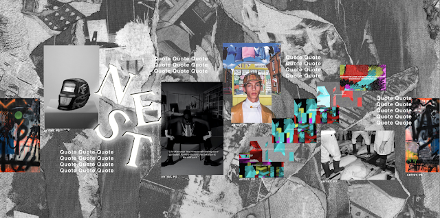
As the VR is for the launch event for the magazine, I din't want to create a VR version of the magazine, but instead create a virtual immersive gallery where the work featured can be presented to the viewer so that they are surrounded by The Class Issue. This will give them a taste of what they can read about in the magazine, so that if they see something that interests them, they may want to pick up a magazine to find out more.
The initial ideas I had for the design of the VR was to display the work on the centre of the image with a collage background that the NEST team created. This reflects the way that The Class Issue is designed; the work on the collage background. I decided adding quotes around the work would make more of an interesting visual, giving an insight into what is discussed in the interviews of the magazine.
This is a test for the VR to look at sizing and layout. After testing this in 360, the sizing of everything should be reduced and there is room for more work to be displayed.
Development
After testing the layout, me and the NEST team also decided that the logo should be featured. I wanted it to be large and in your face, as if it were glowing. So I made it look more 3D and added an outer glow to make it come out of the space more. This added more depth to the VR as well as communicated that NEST is the important part to remember.
I then experiemented with adding colour, as I felt it could be incorporated in some way. I made the NEST logo yellow in the hopes it would look neon to reflect the working class and their uniform. However, this didn't look very neon yellow and the link to a workman's uniform wasn't clear. Also, yellow isn't used in the magazine, so it would feel out of place.
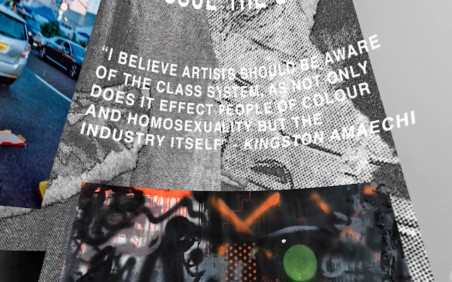
After adding the logo, I added more work and the quotes. I also added 'The Class Issue' along the top to title the collection.
Final outcome
The final outcome for the VR gallery is successful in presenting the work in an immersive environment where you can see them on a large scale rather than in the book. The design decision of having limited information on each piece and the quotes creates a good introduction to the magazine, enticing people to pick up a copy to find out more. The logo white and glowing makes it stand out more, giving NEST more of a hierarchal stance. The type layout for 'The Class Issue' circling the VR communicates what issue it is, giving the VR context, however I think it looks out of place.


No comments:
Post a Comment