Deadline 29/11/19 1:30 - 3:00
Using findings from brief 1, create an immersive and engaging screen based user experience for a meda of your choice.
Think about the target audience, the aim of the project, and the form of the screen.
Is it to be viewed on a global scale? Where is the screen viewed and why?

You should consider the following:
- The processes and procedures involved in designing
for screen. - The relationship between designer and developer.
- The role and skill set of the developer (and where you would
find a developer to work with) - Research - what already exists in the design field, how
innovative can you be.
Examples of design for screen:


All This Rotting by Alan Trotter uses the digital platform to create moving type. https://editionsatplay.withgoogle.com/#!/

Online work by Joe Hamilton that involves the user to explore a digital landscape of layered photographs. The different layers move at different speeds to create the illusion of depth. This is in the attempt to 'depict contemporary landscape, in a moment defined by the proliferation of digital technologies and the global
transportation of bodies, commodities and goods.' https://indirect.flights

http://postmatter.merimedia.com/ POSTmatter is a digital art magazine, designed with a print-informed, yet expansive and experimental approach. This brings the magazine more design potential, however tests the limits of the point in which the magazine becomes a blog.
Patrick thomas
Sight inspire https://www.siteinspire.com for different website designs.
https://toggl.com/timesheets-magazine-berlin/index/ T:imesheets Magaz:ne is a digital magazine that takes the best of both digital and print. Aspects of print are obvious, such as the two page spread and sliding pages. However the use of its digital form brings a more playful interactive element. It allows more rule breaking design to be incorporated without breaking design rules. For example the large title with a playful typeface, which is adding a personal element to the article, is spread across both pages, disrupting the reader to read anything behind it, however as this title only appears when hovering over one of the names, this disruptive design can easily be taken away, allowing the reader to have more control over what they would like to view. This can give more design potential to the magazine that print may not be able to do, however, does this give the reader too much control?
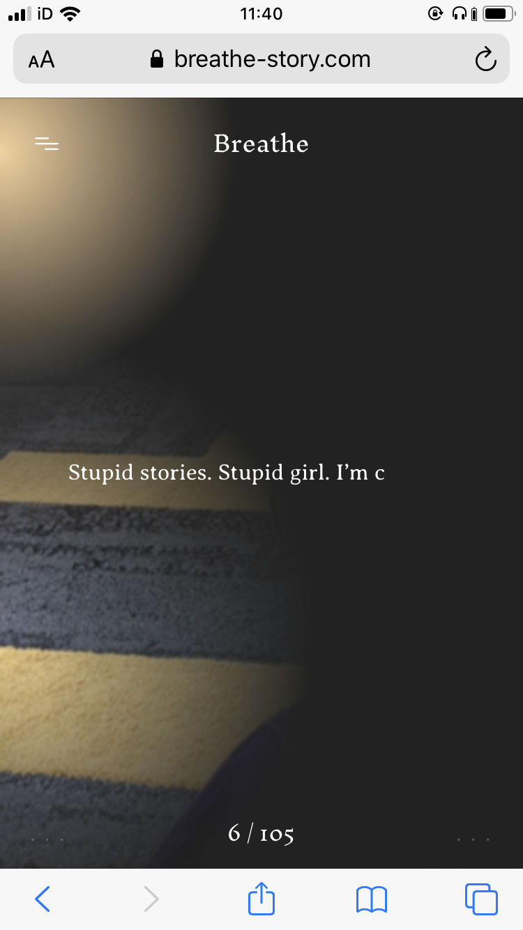
http://www.katepullinger.com/breathe/ Breathe by Kate Pullinger is a ghost story to be read on your phone, created by the experimental publishing house Visual Editions and Google Creative Lab who aim to explore how technology can reshape our expectations of what a book should look like. This book uses your phone data to personalise the narrative for each read. It takes the data of your location, time, weather, etc. to edit the story and feel as though a ghost is following you. In a way it's an infinite story. https://vimeo.com/266299944


Evidence for submission:
1. Studio practice blog labelled "OUGD504 SB2” PDF uploaded to estudio. 2. PDF Design boards submitted on blog.
4. Finished outcome evidenced on blog. Clearly label this as Final outcome.(Where possible: working/animated/navigable prototypes.)
3. Evaluation (for module as a whole) evidenced on blog.
No comments:
Post a Comment