The first typeface I used for the poems was Helvetica, which I chose for the neutrality of it. However, using other typeface I could bring further meaning to the poem. I experimented with New Times Roman, which is commonly used in poetry books for its readability. I also tried using a typeface called Steps-mono, which is a stylised typeface, that looks more contemporary.
Sticker
From the first name idea, I created a sticker design that could come with the book.
Layout for the inside of the book
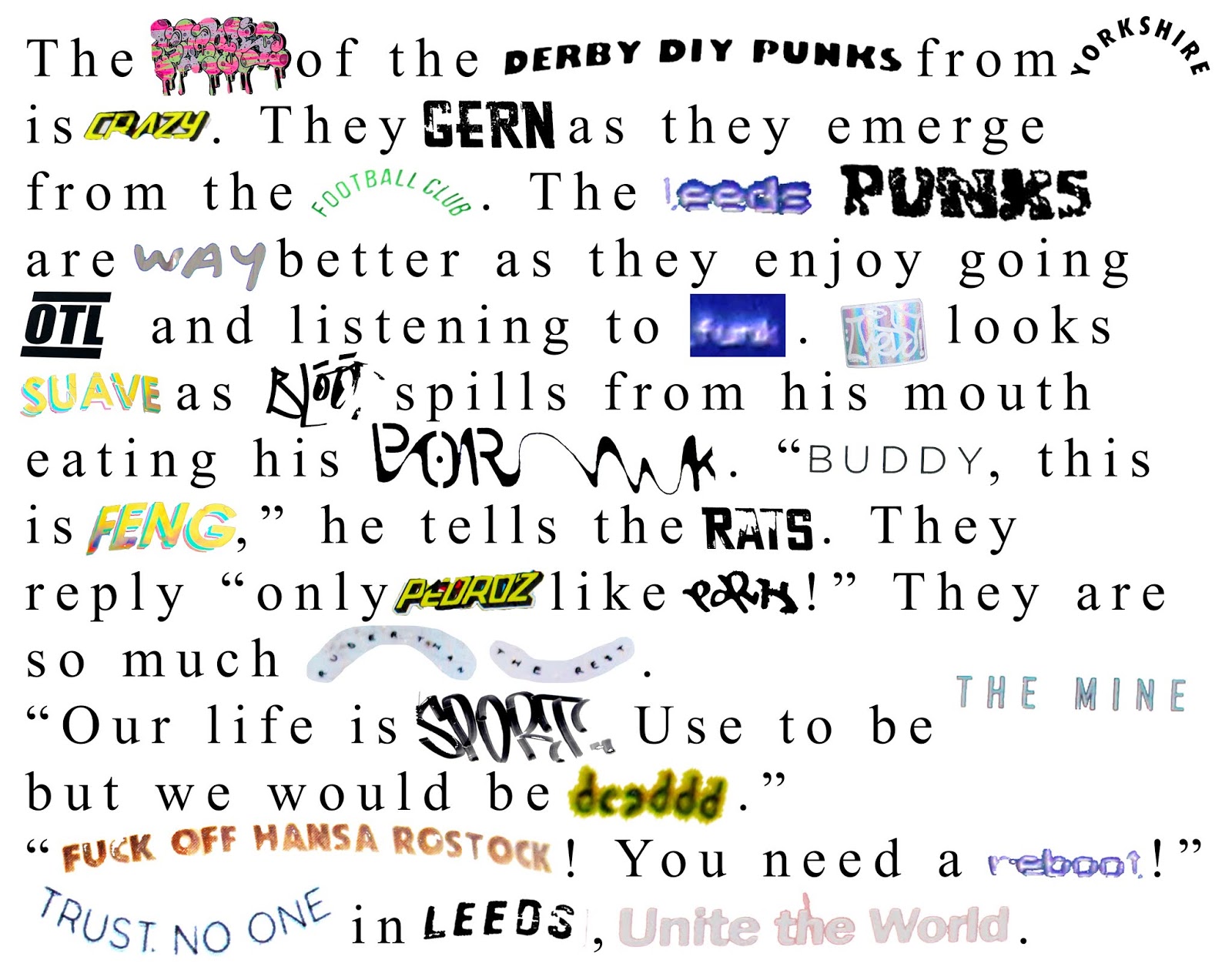
The layout of the book should clearly display the poetry and the title. I decided to illustrate it using the pictures from the stickers. This design works well, however it is a bit plain and boring.

To improve the design I edited the first poem to improve the kerning and the paragraphing so that it is easier to read. I then added more stickers around the poem to represent the appearance of stickers in the street, as they are placed chaotically.

I did this for every poem, as well as creating two pages for the introduction and two for the original images at the back.


Images of the design in book form


Feedback:
- Pictures from stickers look low quality. Threshold them.
- Some words from stickers are hard to read. Edit them, make them darker and make the text larger.
- The images of the stickers on final page should be blue and bitmapped, and the map behind doesn't work well.
- Screen print the whole thing. Everything bitmapped or threshold. Remove the white stoke.
- Could be a concertina?
- Could be packaged in a coloured opaque sleeve with poster and stickers?
- Flag?
- Could print onto sticker paper and cut poems out so that people can take the poems off and stick around leeds or for personal use.
 |
| Helvetica |
 |
| New Times Roman |
 |
| Steps-mono |
I decided that the New Times Roman typeface works best as it references poetry book as increases the readability of the poem. I tried it with the stickers and text colourised blue, which worked well in unifying the overall appearance of the poem.
 |
| New Times Roman coloured blue |
Sticker
From the first name idea, I created a sticker design that could come with the book.
 |
| This design doesn't work well it doesn't use the space well. There is too much going on and the layout is confusing and uncomfortable. |
 |
| This design is improved, making better use of the space with a more professional appearance. However it is lacking excitement due to only using one tone. |
 |
| This design has yellow as a background to the text and image which makes them more eye-catching as they are in the foreground due to their darker colour. |
 |
| In order to create more visual consistency I added the bitmapped gradient to the background, which is used throughout the book. |
Layout for the inside of the book
The layout of the book should clearly display the poetry and the title. I decided to illustrate it using the pictures from the stickers. This design works well, however it is a bit plain and boring.

To improve the design I edited the first poem to improve the kerning and the paragraphing so that it is easier to read. I then added more stickers around the poem to represent the appearance of stickers in the street, as they are placed chaotically.

I did this for every poem, as well as creating two pages for the introduction and two for the original images at the back.


Images of the design in book form


Feedback:
- Pictures from stickers look low quality. Threshold them.
- Some words from stickers are hard to read. Edit them, make them darker and make the text larger.
- The images of the stickers on final page should be blue and bitmapped, and the map behind doesn't work well.
- Screen print the whole thing. Everything bitmapped or threshold. Remove the white stoke.
- Could be a concertina?
- Could be packaged in a coloured opaque sleeve with poster and stickers?
- Flag?
- Could print onto sticker paper and cut poems out so that people can take the poems off and stick around leeds or for personal use.
No comments:
Post a Comment