Crit:
- Map is a strong idea.
- Print on 1 side, holes on other side?
- Use image of uni or Mika Vainio and crop extreme for inside of sleeve?
- Pick one map layout to poke holes all the way through sleeve?
- Limited colour & minimalistic.
- Map is a strong idea.
- Print on 1 side, holes on other side?
- Use image of uni or Mika Vainio and crop extreme for inside of sleeve?
- Pick one map layout to poke holes all the way through sleeve?
- Limited colour & minimalistic.
Chosen typeface is the Finlandish typeface design by Helsinki Type studio as it relates to the genre and has a clean, simple look to it, relating to the minimalistic music.
Text following shape of map of Helsinki uni of technology:
Inner sleeve imagery:
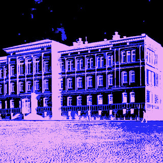
Bitmapped image of Helsinki Uni of Technology
Relates to genre well and the map idea. Colours don't relate.
Bitmapped image of Mika Vainio
More effective as relates to tracks more. Haven't used colour to keep minimal. Could introduce a new layer that is lime green as a common rave colour? Or the blue of the Finnish flag?
Converted audio to sound-wave:
Stratostaatti
Syvyydessä Kimallus
Sähkö recordings logo adaptation:
 |
| Original |
 |
| Experimentation with repetition. Too chaotic for minimalist sound of music? Repetition aspect links well with music. |
 |
| Using parts of the label to incorporate the artists names on record. Effective as looks clean and simple, and very similar to how Sähkö creates labels whilst using Helsinki Finlandish typeface. |
I chose to create an envelope for the sleeve to go in as this is a common thing Sähkö recordings do. Using label like Sähkö recordings do, combining with sound waves. 'Made in Finland' on back to show that the music was made in Finland, typeface Finlandish by Helsinki Type Studio.
Label design:
For label I want to represent the Ø shape using type. Effective but a bit boring? However simplicity represents music well.
Adding the image of Mika which ties whole record sleeve design together nicely. Is it necessary though?


No comments:
Post a Comment