DESIGN PRINCIPLES
This module will look at design principles of areas of graphic design. This brief explores typesetting; the relationship between frame, format, figure and ground.
TYPESETTING
Main principles - type, type setting, layout, colour theory.
The letter - glyths & atonomy
The word - how glyths fit together
The line - combination & arrangement of words in a body or sequence
Typeface is the physical embodiment of letters. ← what you use
Font is the set of characters within a given typeface. ← what you see
Anatomy:

Erik Spiekermann
His approach to type design is that he is adding the instrument to the sound of the letter. He creates the sound of the text. The letters are rhythm, not form, and it is the silence that makes the rhythm (e.g. the counter in a 'P' creates a stop in the rhythm). We read the contrasts, not letters or words. If he likes the look of something he will draw it from memory. This way, he does not draw an exact copy, but a new original form.
TASK 1
For the task I started by looking up my word, 'order', in the dictionary; 'the arrangement or disposition of people or things in relation to each other according to a particular sequence, pattern, or method' or 'an authoritative command or instruction'. Synonyms include sequence,arrangement, disposition, structure, system, instruct, command, direct, etc. The opposite of order would be disorder or chaos, disarrange, jumble,muddle, etc.
I took the futura typeface and chopped them up to rearrange the form. However, upon reflection, the meaning of the word 'order' was taken too literal and the rule of 'rearranging the order of the form' was too broad, disturbing the flow of the typeface.


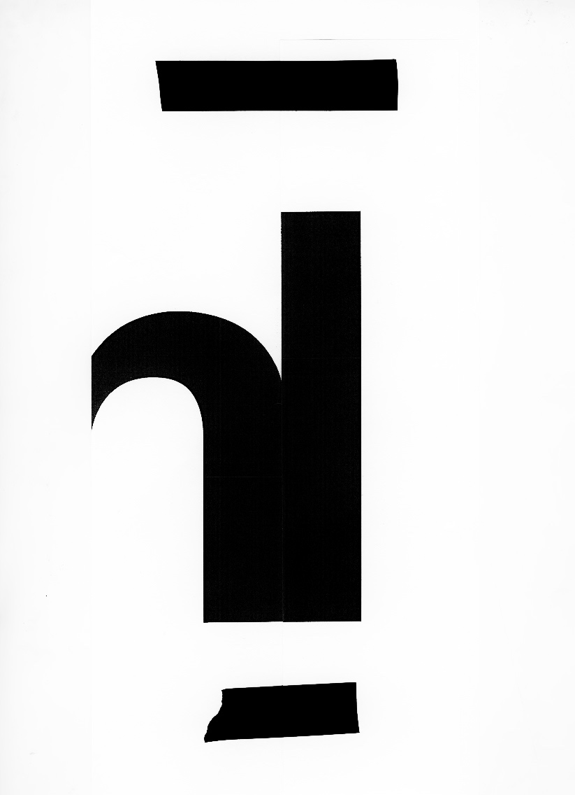


In order to improve the flow of the typeface, i am more selective and strict with the rule used for my third design. Using the Times Roman font, I changed the order of the serifs at the top of the form of each letter. This works well as the type is still very readable and there is a good flow to the typeface. However, I should have gone further with this idea and changed all of the serifs as the letterform hardly changes and it's a bit boring.


My final design looks at re-arranging the negative space in the letterform, such as the counter, crotch, ink trap, and eye. This works well as the typeface is still readable and relates to 'order'. However, I did find the 'X' difficult as it uses more negative space.


NOTES ON JOST HOCHULI'S "DETAIL IN TYPOGRAPHY"
- Our brains read the letterform then associate, triggering feelings.
- Typefaces cannot be bad or good as they are designed to meet demands and functions.
CONTINUOUS TEXT
- Continuous text must remain the same as the reader is only interested in the meaning, not the appearance.
- This is a reason German 'type artists' were forgotten before and after first world war - too 'different' and 'excellent'.
-Same for Bauhaus - also seen as too 'different' as it put form first, not readability.
- Paul Renner's Futura outlasted its period because it responded to the spirit of the age and its'need for impersonal forms', whilst no deviating from familiar letterforms.
- Characteristics of good, timeless book type:
- Shouldn't distract reader with unfamiliar form. Thereby alphabet must have same style, but each letter must differentiate clearly.
- Capitals and lowercase letters should work in harmony.
- Capitals and lowercase should have the right proportions.
- The relationship between capitals and lowercase should not disrupt the overall appearance of the typeface. Capitals should be lower than the lowercase ascenders.
- The legibility of a typeface depends on the differentiation of the upper half of the x-height, which puts most sanserif faces at a disadvantage.
- Optical facts:
- For a circle and triangle to appear the same height as a square, they must extend slightly beyond top and bottom lines.
- The dividing line must lie above the mathematical centre - the optical centre.
- Balanced verticals and horizontals will appear to be of the same weight if the horizontal is narrower.
- Where curves intersect with straight lines or with other curves, or where two diagonals meet, lumps should be corrected.
- Small sizes of type need to be proportionally wider than other sizes.
- Captial A & L are particularly legible. B & Q not so. B confused with R, G with C & O, Q with O, M with W.
- Lowercase d,m,p,q are easily legible. j,r,v,x,y averagely so. c,e,i,n,l are difficult. c confused with e, i with j, n with a, l with j.
- Italics need less space as it has leaner proportions. 'Italicising' does not take into account optical considerations, leaving an unsatisfactory result. Slope should be no steeper than 10 degrees, or it will be too distorted.
No comments:
Post a Comment