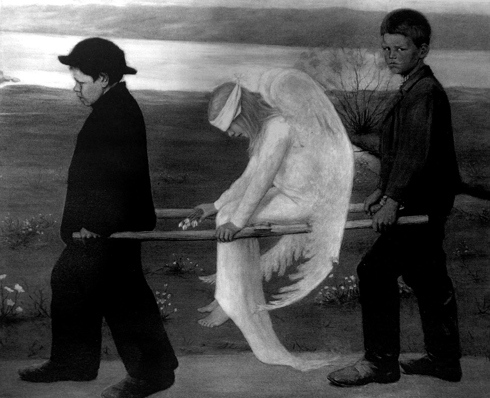
Using a painting by a Finnish artist and my type design for the cover of my album I created these variations of colour images. They indicate how the contents would look using just two tones - similar to when screen printing.
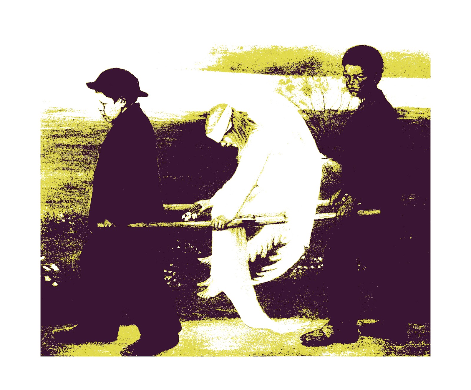


I think the inverted images are most effective and relate to my genre more as I relate electronic in Finland with the dark atmosphere of the raves that started it all. Neon colours also work well as this too relates to the rave scene. Also, the electrifying tones of black and neon have a clear link to electronic music.
The type cover I created acts as a perfect grid to fit image into, leading me to the last design that layers many images over each other. Although I think this looks good, it is an ineffective design as it is too chaotic, not representing Vainio’s sound. This is also true of the pictures fitting into the typographic grid concluding that the type cover should be left simplified with just the type, experimenting more with the physicality of the sleeve itself.
I also decided from this to choose an image more relating to the music, such as an image of Vainio, as although I like the painting and its aesthetic, the only link between this and the genre is the fact that it is Finnish.
No comments:
Post a Comment